Ventera Case Study

Project Summary
Goal
Design a new proof-of-concept platform to help Financial Advisors improve client engagement and streamline workflows, supporting Wells Fargo’s digital transformation.
Role
Lead Designer, UX Strategy & Research
Responsibilities
Led design direction and overall UX strategy.
Planned and ran brainstorming sessions, workshops, and design reviews.
Worked directly with stakeholders and developers.
Conducted user interviews and gathered research insights.
Prioritized design tasks with the product team.
Client
Wells Fargo
Product
Wealth Management platform (B2B tool for Financial Advisors)
Team
Program Manager, Product Owner, Designer, & UX Researcher
Time Frame
6 month engagement
The Problem
What Wasn’t Working
Financial Advisors had to switch between multiple systems to complete one task.
Report creation was slow and frustrating.
New hires from other banks found the tool outdated.
Long-tenured Financial Advisors accepted inefficiencies as “just the way it is”.
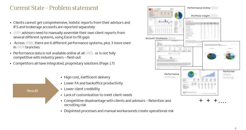
Why It Mattered
Time lost = fewer client interactions
Workflow inefficiency hurt advisor performance.
Digital tools didn’t reflect Wells Fargo’s innovation goals.
Users Research
Primary Users
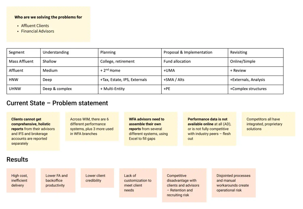
What We Did
Interviewed 12 Financial Advisors with varying experience levels and technical skills.
Ran discovery sessions with internal stakeholders.
Mapped customer journey, key workflows, priorities, and pain points.
Reviewed current tools, documentation, and support content.
Key Insight
The research revealed clear patterns across different user types.
Power users needed speed, customization, and fewer clicks.
New users needed clearer guidance and a simplified starting point.
Everyone wanted one tool to replace multiple systems.
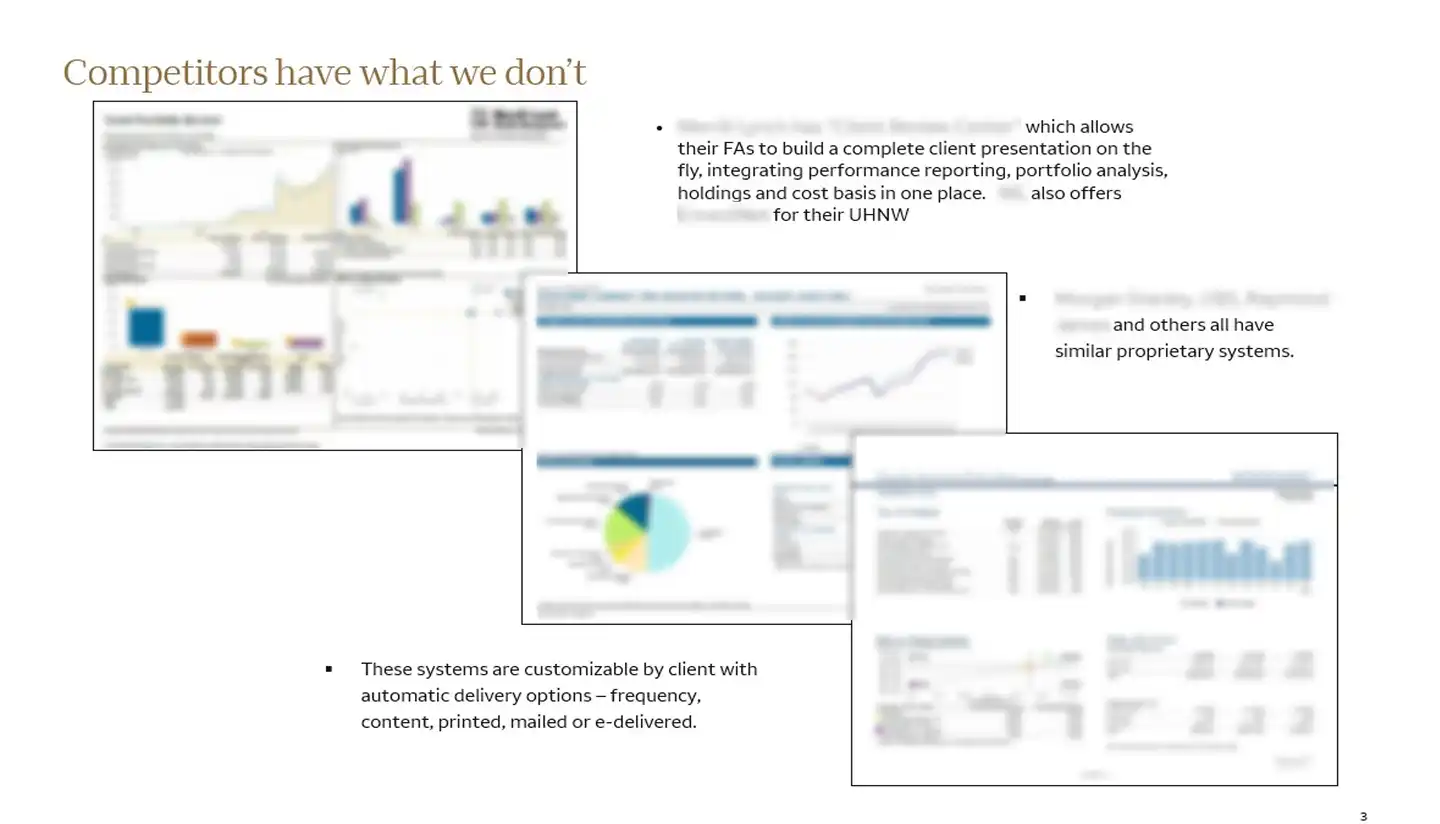
Challenges
Advocating for User Needs
Although we faced skepticism about prioritizing Financial Advisors workflows over backend upgrades, we gained alignment by reframing user pain points as risks to client retention.

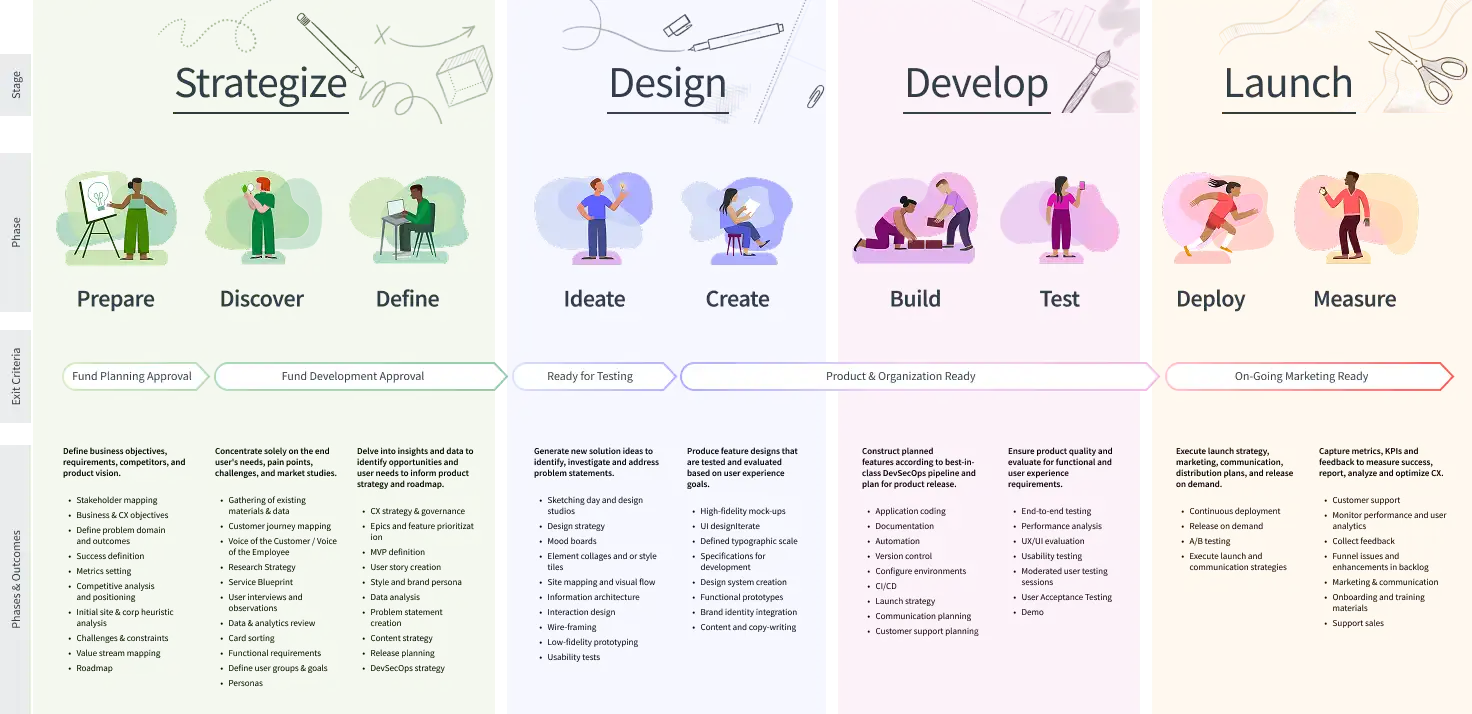
The Process
Discovery

Defining the Vision
Aligned with stakeholders to clarify goals, define success metrics, and understand the business context.


Research
Understanding Users
Interviewed Financial Advisors and observed workflows to uncover pain points, needs, and tool limitations.
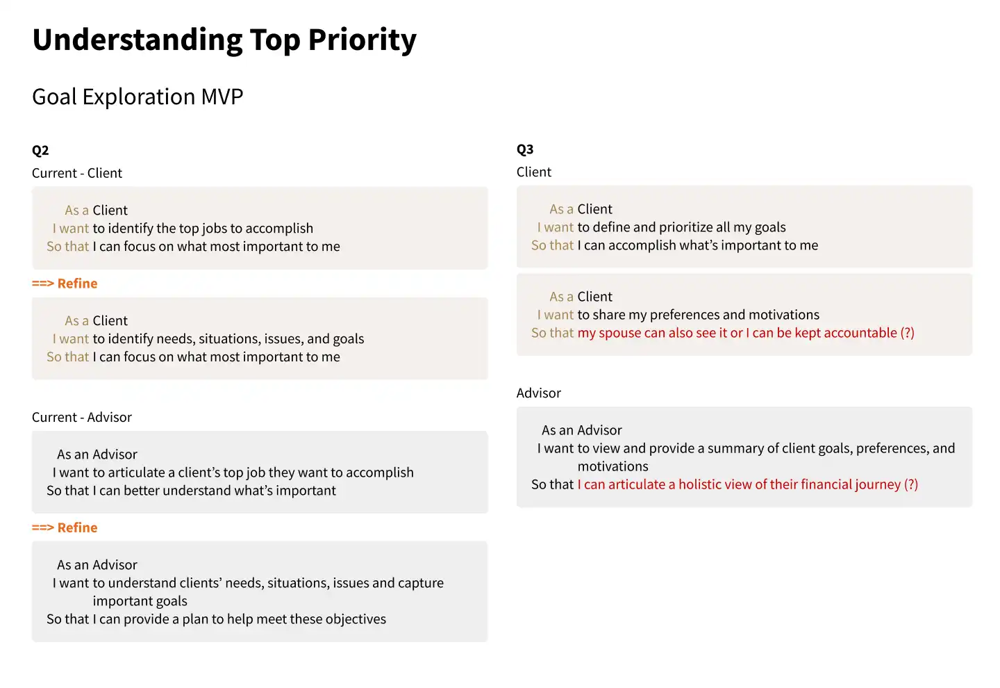
Ideation

Exploring Possibilities
Ran collaborative sessions to brainstorm ideas, sketch workflows, and map out early concepts.

Design

Bringing Ideas Together
Created and refined wireframes and interactive prototypes based on feedback and evolving priorities.
Testing

Validating and Refining
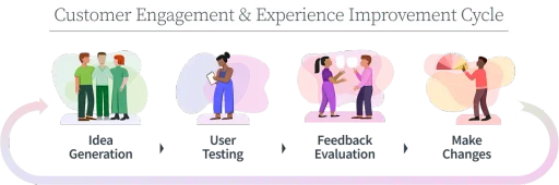
Held weekly review sessions with client teams to gather feedback, test assumptions, and improve the design.
Results
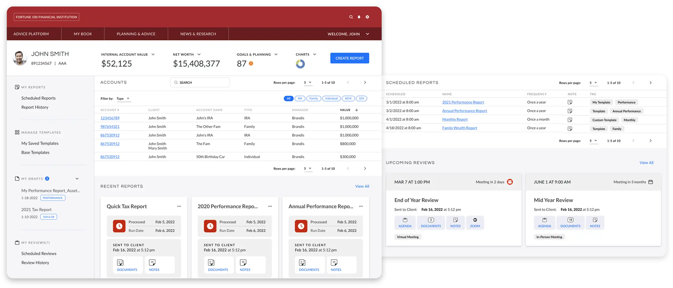
Platform Redesign Puts User Experience First
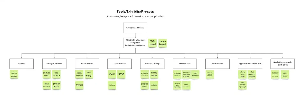
We designed a platform prototype with four key improvements:
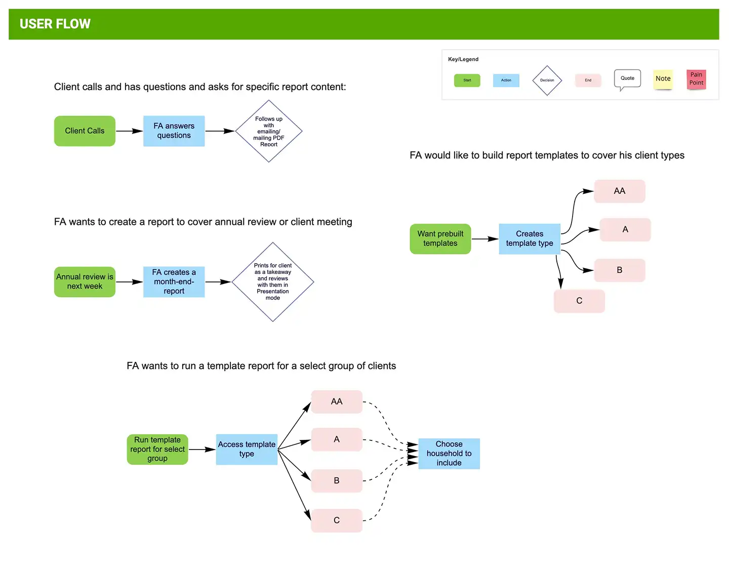
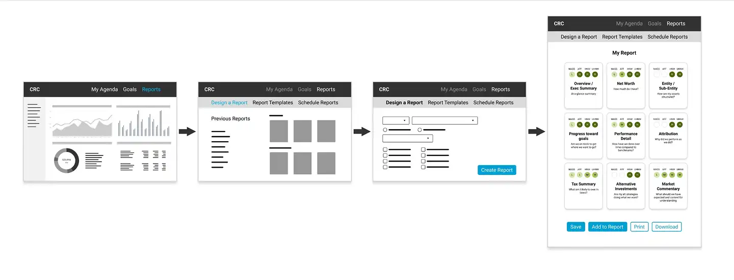
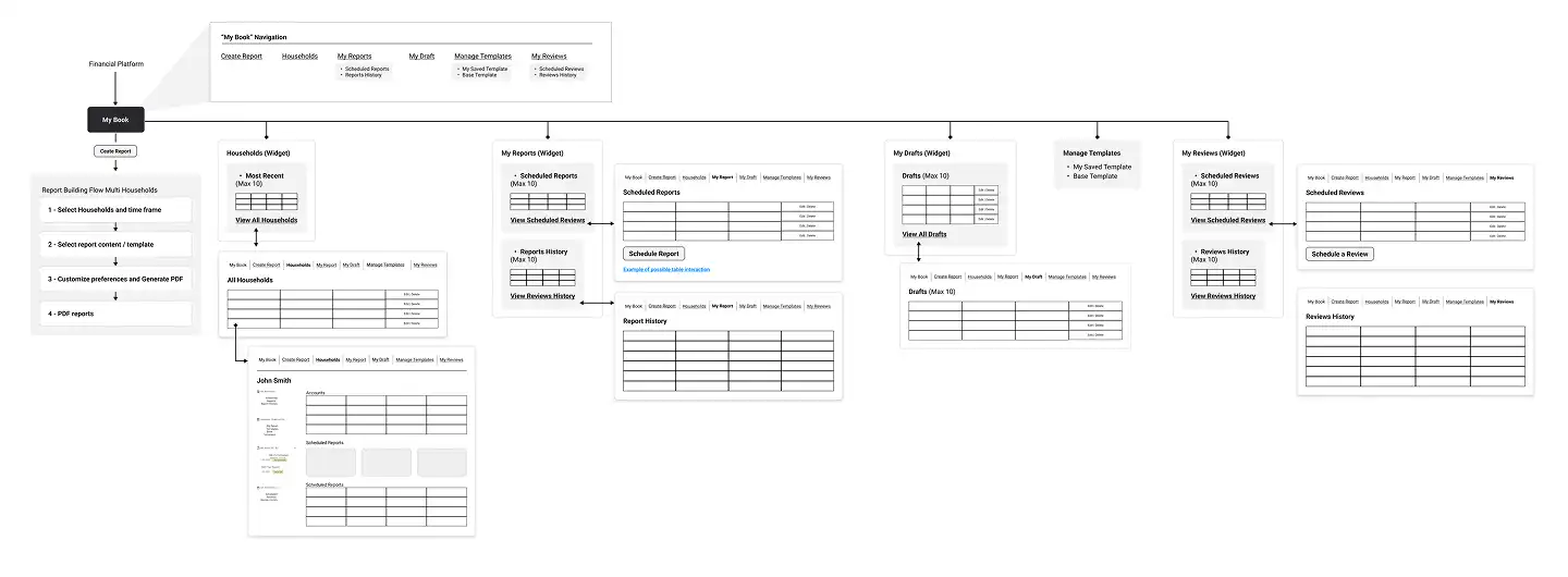
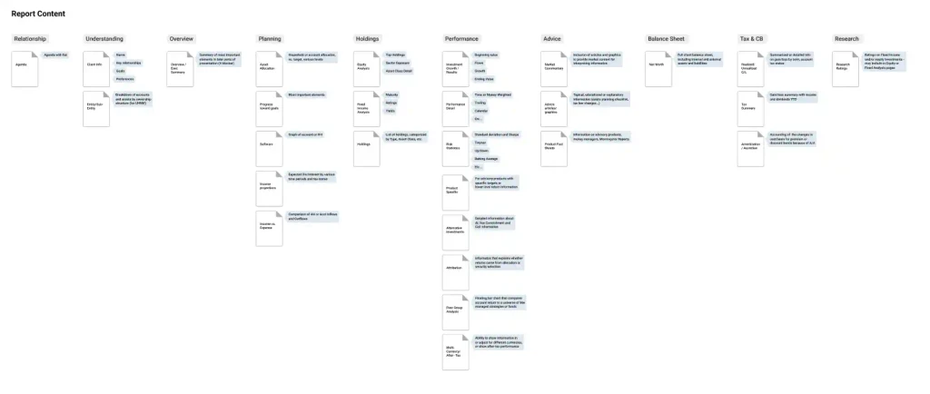
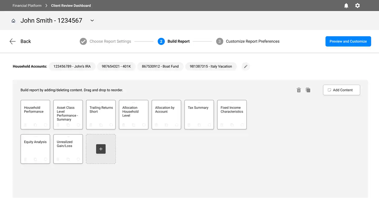
Simplified Workflow: Reduced report-building steps from 8 to 3 and minimized tool switching.
Clear Language: Used plain, direct labels and prompts to speed up understanding.
Flexible Interface: Added tooltips and onboarding for new users, plus shortcuts for experienced users.
Guided Experience: Used micro-interactions to give feedback and keep users on track at every step.
Delivery
Better Reports Mean Better Client Conversations
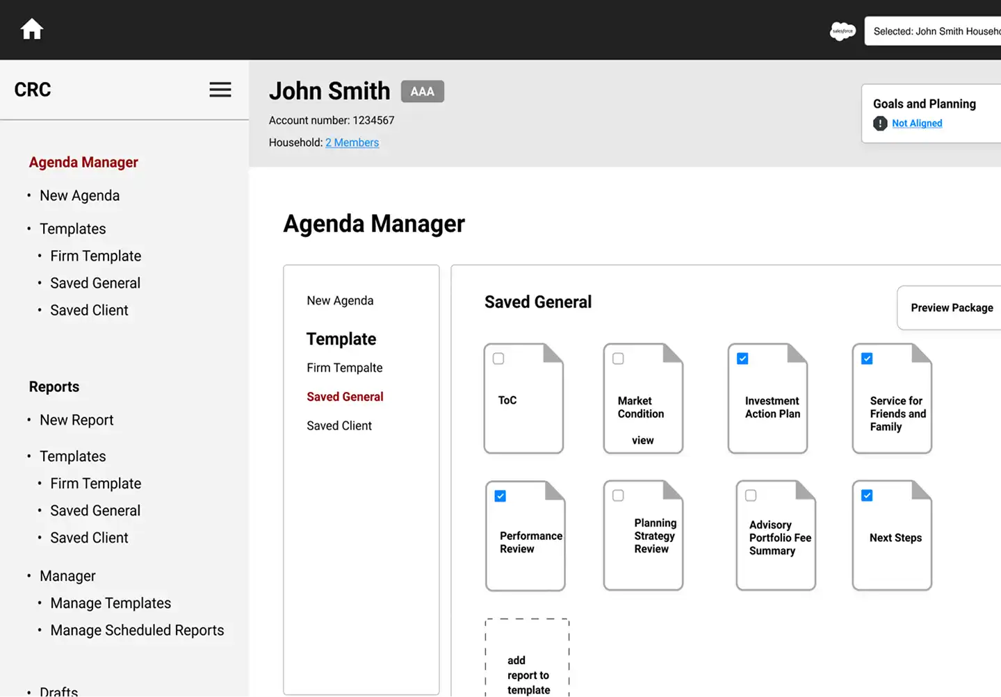
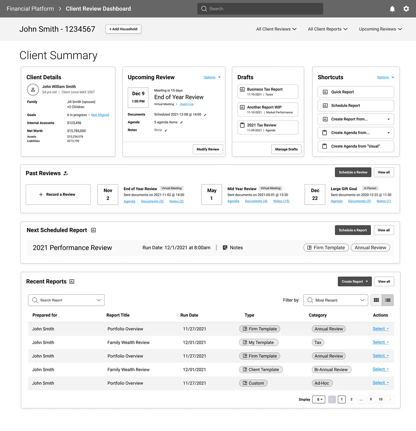
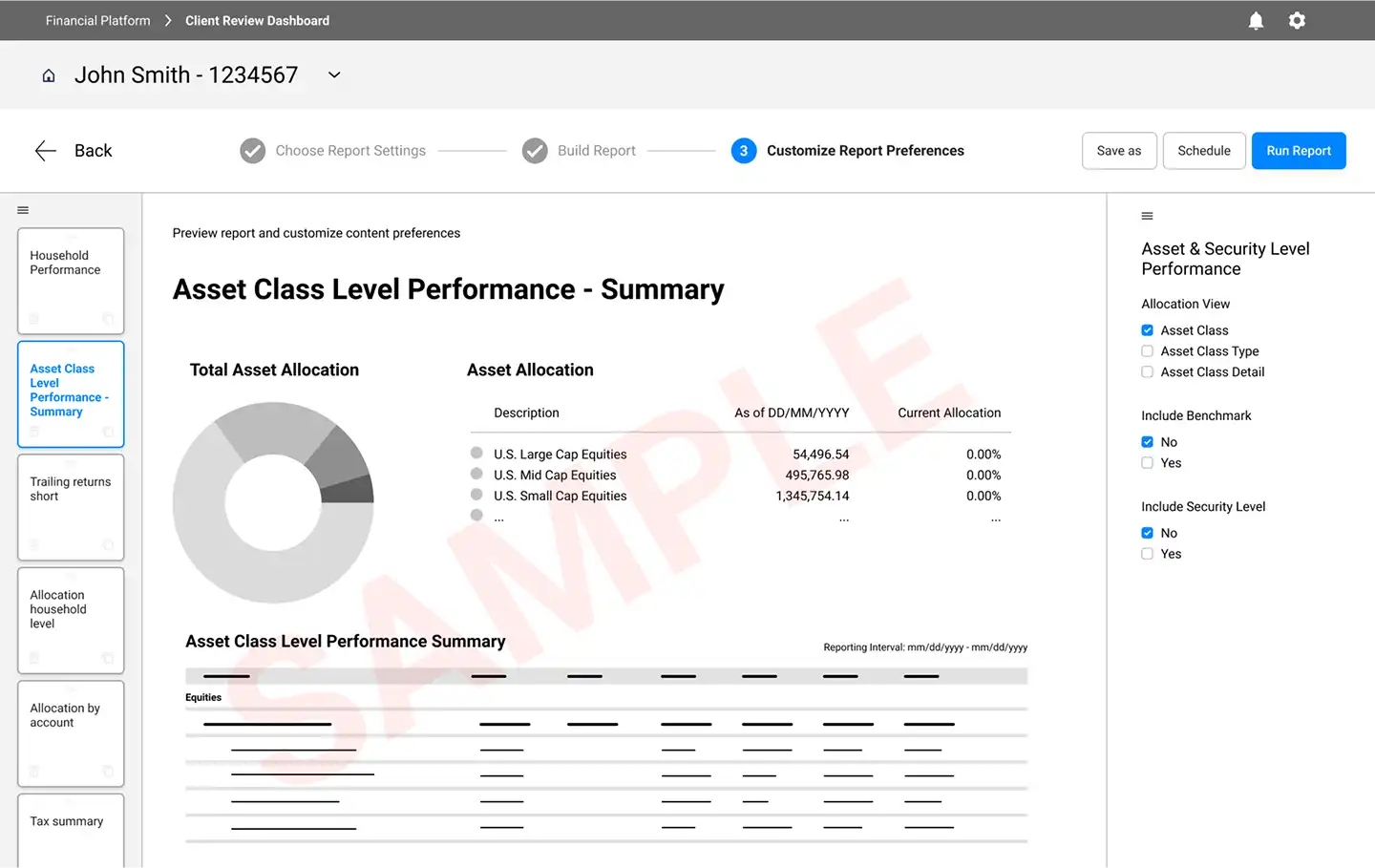
Future-State Prototype: Built an interactive demo showing a unified workspace for client reports to reduce tool-switching.
Strategic Roadmap: Outlined a phased plan with quick wins like data-export tools and long-term goals like API integration.
Design Handoff: Delivered a complete design system, UX patterns, and high-fidelity mockups.
Scalable Framework: Created a repeatable design approach the client could apply to future product work.
Faster Iteration: Held weekly design reviews to stay aligned and move quickly based on feedback.
What I Learned
Users don’t always ask for improvements, but that doesn’t mean they don’t need them.
What I also learned from this project:
Navigating ambiguity and driving consensus at the executive level requires translating insights into clear, actionable outcomes.
Early alignment with stakeholders is critical to avoiding costly delays later in the process.
A user-centered vision, communicated through clear design artifacts, can effectively bridge the gap between strategy and execution, even in complex enterprise environments.
In financial tools, using plain language and minimizing clicks has a measurable impact on usability and user satisfaction.